It has been about three years since I submitted the third and final book of my “Gods of the New World” trilogy to my publisher. If you have followed this blog, you know that my publisher, Diversion Books, decided to publish only non-fiction going forward. My fantasy, no matter how climactic, did not qualify. Diversion’s first offering in non-fiction was a memoire by Corey Lewandowski, a man so vile that even Michael Cohen despises him. I felt that perhaps Diversion and I were never going to be really close. They are still making my first two books available, so I don’t want to make them mad.
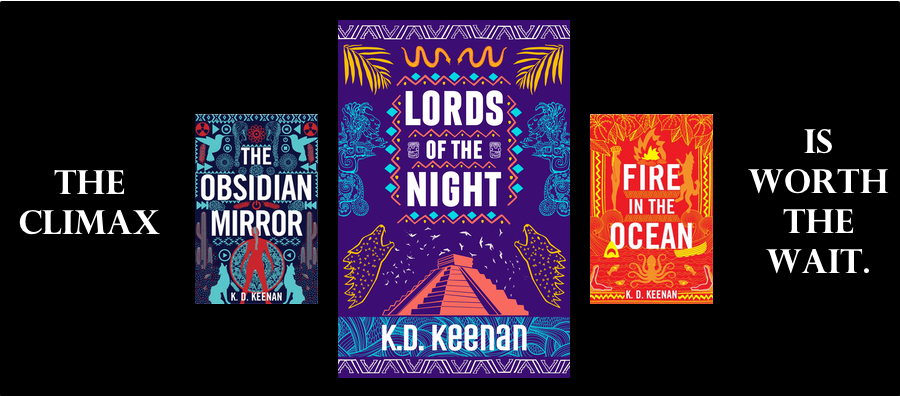
But this did leave me in the middle of a trilogy without a climax. I felt bad for the few people who had read “The Obsidian Mirror” and “Fire in the Ocean,” who rightly expected a satisfying ending to Sierra and Chaco’s adventures—and relationship.
About a year and a half ago, I attended the World Fantasy Convention, held in Los Angeles that year. I went there with a short list of people I wanted to have a discussion with—an editor for a large publishing company, a publisher, and an agent. I told each of them the quandary I was in—third book in a trilogy, no publisher—and their answers were fairly uniform: I, a fairly obscure fantasy author, was not going to find a publisher to pick up the trilogy, much less the third book of a trilogy. My best bet was to publish on Kindle and move on.
Okay. Not the optimal solution, but I am not Neil Gaiman, either. I asked a dear friend, a graphic designer, to create a book cover for the third and final, climactic novel, “Lords of the Night.” Then I went to Iceland and started writing a completely unrelated fantasy about a slightly defective magician in ancient Iceland. That tale is in the throes of final polishing.
But my designer friend had a very tough year—tougher than for most of us, as horrible as 2020 was. She was unable to complete the artwork. I needed to move forward—I had a delayed climax on my hands, after all! I gave it some thought and then learned a new art program for the iPad called Procreate. I loved it so much that I decided to tackle the cover art myself.
This wasn’t an easy decision. I knew my friend’s graphic talents would result in an entirely gorgeous cover, perfectly in tune with the covers of the other books. I am an artist, but I have no design training, so I realized that the final product would not be as wonderful as the first two covers.
But all we do what we must. So I have produced two covers. I would very much like to hear your opinions on which version is closest in style to the first two covers. First, pleaze take a look at the covers for “The Obsidian Mirror” and “Fire in the Ocean”:


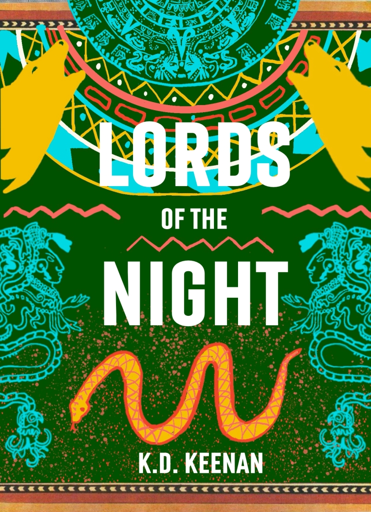
So which do you vote for? Cover 1 or Cover 2? Or are they both terrible? I can take the criticism—I’m a writer. Please leave a comment–much appreciated!

Definitely Cover One is the best.
It looks more professionally done, and hints at the contents.
Cover two is trying too hard and not as well executed.
Please let me know which you pick and why you picked it.
Abbe
LikeLike
Thanks, Abbe! I’m working on yet another version that I think nails it pretty well, if I do say so myself. It was a very tough project for me to tackle. Kerry gave me a lot of excellent advice, as she has actual training in graphic design.
LikeLike
I prefer the first cover (although it needs your name on it somewhere). The second one feels too cluttered to me.
LikeLiked by 1 person
I couldn’t open the covers.I’ll ask Jerry to help with your instructions tomorrow.
LikeLiked by 1 person
Hi Kathy,I never got to beta edit the third book (unless my memory fails me). I hope you are happy with the results. My fingers are crossed for an editor you are happy with. And a terrific cover!Love ya!
LikeLiked by 1 person
I’m not a designer, either . Where are my thoughts for what they are worth. I prefer the second design. The verticality is consistent with the first two. The first two are more or less monochromatic and use fewer colors. If you want the colors to indicate you are tying things up, maybe the turquoise or purple from book 1, orange or yellow from book 3 and something. Not a big fan of green but if you want green, maybe stick with blue or yellow to stick with that part of the color wheel. Good luck!
LikeLike